©2015 Daniel Christianson and ConnexUs. All rights reserved.
With the research and exploration for the user experience completed, I took the data I gathered and began exploring a visual design based on the wireframes and the functional prototype I developed.
For details on the user experience research methodology I used to develop my mobile app, click here.
To view video of a typical use scenario, click here.
The goal was to create screens that were easy to discern and that followed a logical order, enabling users to quickly block out available calendar time, create unique social circles, and plan an event. So easy that an impromptu coffee klatch is a breeze to pull together while on the go!
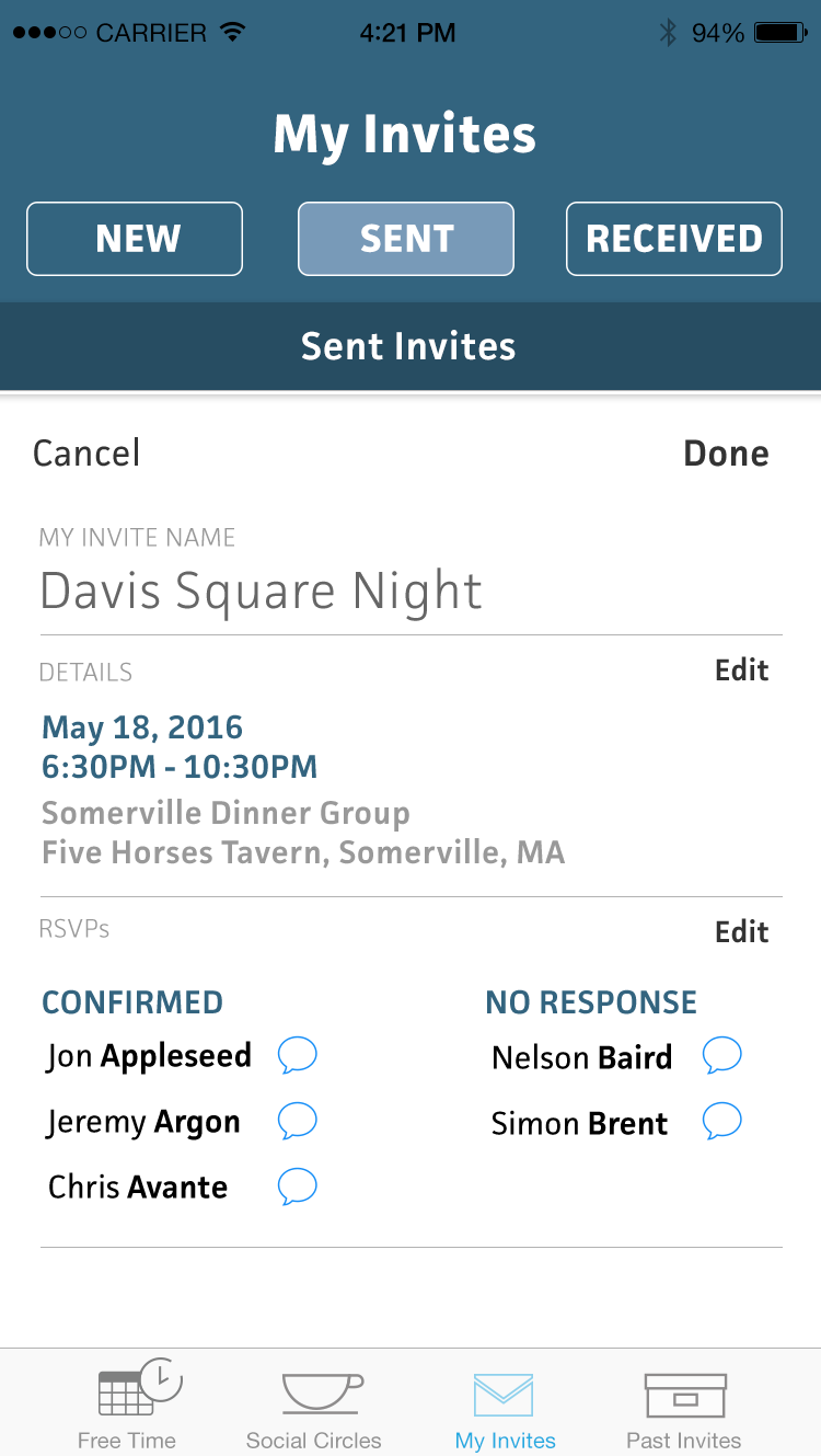
Below are a series of screens I created for three of the main sections of ConnexUs. It was important that the screens demonstrated a consistent and familiar experience for the user. Click a thumbnail to enter slideshow mode.


